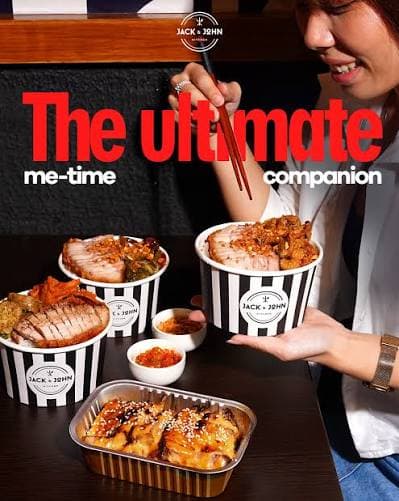
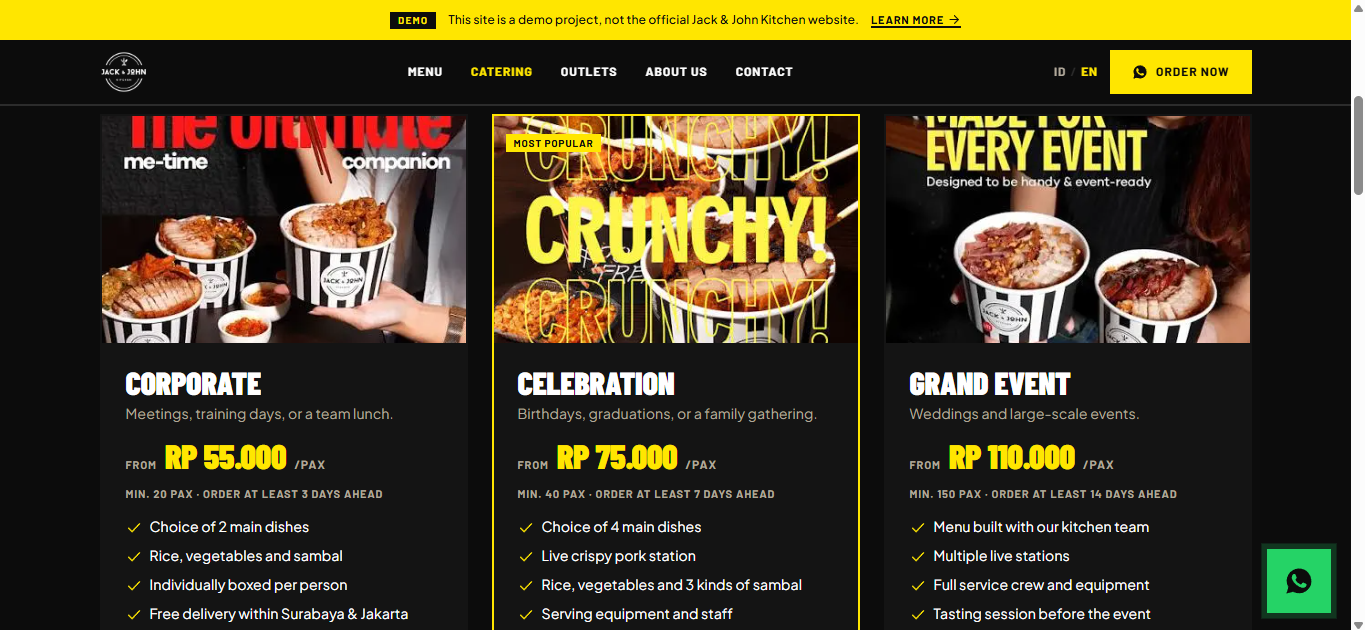
Corporate
Meetings, training days, or a team lunch.
FromRp 55.000/pax
Min. 20 pax · Order at least 3 days ahead
- Choice of 2 main dishes
- Rice, vegetables and sambal
- Individually boxed per person
- Free delivery within Surabaya & Jakarta
Demo Project Brief
Official Website — Concept & Delivery Plan
Version 1.0 · Demo document · Not official material from Jack & John Kitchen or ISMAYA Group
Jack & John Kitchen is a fast-casual crispy pork chain with 10+ outlets across Surabaya and Jakarta, backed by ISMAYA Group. Despite strong offline traction and an active Instagram with 24,000 followers, the brand has no website of its own. All digital discovery depends on third-party platforms: GoFood, GrabFood, ShopeeFood, Instagram, and a single link-in-bio page.
This project is a demonstration prototype of that official digital home: brand storytelling, a full menu showcase, and streamlined order and catering flows — built for Indonesia's mobile-first, WhatsApp-driven consumer behaviour. The site you are looking at was made as a work sample, not as commissioned commercial work.
| Home | Hero, signature menu, story snippet, outlets, social proof, catering CTA |
|---|---|
| Menu | Crispy Pork, Sweet Soy Pork, Chili Pork, Bundles, Packaged Products |
| Catering | Packages, event gallery, inquiry form, FAQ |
| About | Founder story, the recipe, ISMAYA partnership, timeline, press mentions |
| Outlets | Google map, location cards, Surabaya / Jakarta city filter |
| Contact | General form, WhatsApp, email, social links |
A Bold Street Food Editorial aesthetic — high contrast, type-led and Instagram-native. Deep black background (#0C0C0C), white text, acid yellow (#FFE600) and red (#E8231E) accents. Barlow Condensed 900 for display, Barlow for labels, Plus Jakarta Sans for body. Corners are always sharp — zero border-radius. The black-and-white stripe from the packaging carries the brand through section dividers. Motion is fast and percussive rather than slowly fading, with full prefers-reduced-motion support.
| Layer | Choice | Reason |
|---|---|---|
| Framework | Next.js 14 (App Router) | SSG + ISR for SEO, image pipeline, server components |
| Language | TypeScript | Type safety across every data model |
| Styling | Tailwind CSS + CSS custom properties | Design tokens map straight onto CSS variables |
| CMS | Sanity.io | The brand team edits menu and outlet hours without a deploy |
| Forms | React Hook Form + Zod | Type-safe validation, small bundle |
| Bilingual | next-intl | Bahasa Indonesia (default) ↔ English |
| Resend | Delivery of catering and contact submissions | |
| Hosting | Vercel | Edge network with South-East Asia PoPs |
Architecture style: Jamstack with selective server-side rendering. No custom backend, no database, no authentication. Infrastructure complexity is pushed to managed services so the team focuses on the product rather than on ops.
The original launch plan in the PRD ran eight weeks. The version below compresses it into four working weeks by running content production in parallel with the build, and folding QA into launch week.
| Week | Phase | Output |
|---|---|---|
| Week 1 | Foundation & Design System | Brand research and asset audit. Design tokens locked (colour, typography, spacing, motion). Next.js + Tailwind scaffold. Base components built: buttons, cards, form fields, navigation, footer. Sanity content model set up, photography and copy collected. |
| Week 2 | Core Pages | Full homepage (hero, signature menu, brand statement, Hack Series, story, outlets, social proof, Instagram feed, catering CTA). Menu page with category tabs and product cards. Outlets page with map and city filter. |
| Week 3 | Conversion & Bilingual | Catering page (packages, gallery, FAQ) with its inquiry form. About and Contact pages. Serverless functions for both forms plus email notifications. Rate limiting. ID/EN translations and locale routing completed. |
| Week 4 | QA, Optimisation & Launch | Performance audit (Core Web Vitals, Lighthouse 90+), SEO audit (meta, JSON-LD, sitemap, hreflang), WCAG 2.1 AA accessibility audit, cross-browser and cross-device testing, form submission and WhatsApp link testing, proofreading in both languages. DNS cutover, Search Console, analytics verification, launch announcement. |
Questions, feedback, or anything about this project:
croissantsmoon@gmail.com
Design System Guide
Bold Street Food Editorial — Website Visual Identity
Version 1.0 · Demo document · Derived from DESIGN.md and implementation screenshots
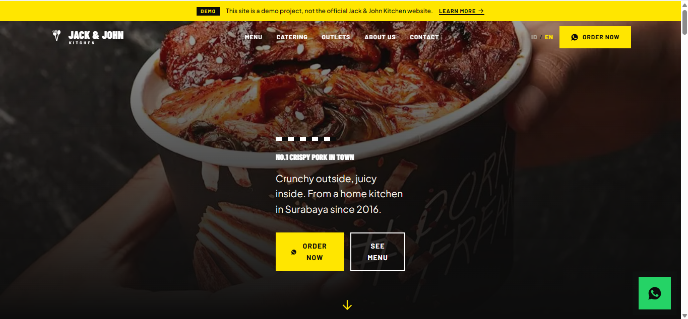
Jack & John Kitchen is not a fine-dining pork house, and it is not a traditional warung either. It occupies its own space: premium fast-casual with street culture energy. Think Shake Shack's visual confidence meeting Jakarta's bold graphic street food culture.
Primary: Bold Graphic / Type-Led. Secondary: Street Food Editorial. Energy: high contrast, confident, unapologetic. Reference brands: Shake Shack (stripes, boldness), Dave's Hot Chicken (type-as-design), Howlin' Ray's (street food premium), Supreme (graphic language applied to food).
A double-circle emblem with crossed fork and knife above the wordmark. The "O" in JOHN is a hollow ring and becomes the visual focal point. "KITCHEN" sits beneath the wordmark in tightly tracked caps.
| Primary — black on white | Light backgrounds, print, embossing |
|---|---|
| Reversed — white on black | Dark backgrounds (primary on the website) |
| Single colour — all black | Monochrome print, stamps |
| All white | Overlay on dark photography, packaging |
| Yellow on black | Promotional / campaign contexts only |
Minimum clear space = the height of the "K" in KITCHEN, on all four sides. Minimum sizes: 32×32 px for the favicon (utensils mark only), 80 px tall for in-page use, and 20 mm diameter in print.
| #0C0C0C | Black | Primary background across all brand material | |
| #FFFFFF | White | Primary text on dark backgrounds, logo | |
| #FFE600 | Yellow | Hero accent, primary CTAs, campaign highlights | |
| #E8231E | Red | Urgency, promos, secondary accent |
| #141414 | Black Soft | Card backgrounds, surface variation | |
| #1A1A1A | Black Stripe | Panel between bands in the stripe pattern | |
| #FFD000 | Yellow Hover | Hover / pressed state for yellow elements | |
| #C41A16 | Red Dark | Red button surface (AA contrast) | |
| #B0A89A | Grey Warm | Secondary text, captions, metadata | |
| #2C2C2C | Grey Dark | Borders, dividers, disabled states | |
| #F5F0E8 | Cream | Alternate light surface (used sparingly) | |
| #25D366 | WhatsApp buttons — platform colour |
| Colour | Primary Use | Never Use For |
|---|---|---|
| Black | Page backgrounds, card surfaces | Body text — use white |
| White | Body text, headings on dark, logo | Dark backgrounds — use black |
| Yellow | Primary CTA buttons, campaign labels, section accents | Long body copy, error states |
| Red | Secondary CTAs, urgency, promo badges | Large text blocks, backgrounds |
| Grey Warm | Captions, metadata, secondary labels | Anything needing high emphasis |
| Grey Dark | Borders, dividers, disabled elements | Backgrounds — too close to black |
| Pair | Ratio | Status |
|---|---|---|
| White on Black #0C0C0C | 20.7:1 | AAA |
| Yellow #FFE600 on Black | 15.3:1 | AAA |
| Black on Yellow #FFE600 | 15.3:1 | AAA |
| White on Red #E8231E | 4.6:1 | AA (large text) |
| White on Red Dark #C41A16 | 6.0:1 | AA |
| Black on White | 20.7:1 | AAA |
| Grey Warm on Black | 5.1:1 | AA |
Implementation note: red buttons use #C41A16 as the surface, not #E8231E. White on #E8231E is only 4.5:1 — fine for large text, but a 14 px button label is normal text and needs 4.5:1 outright. #C41A16 gives 6.0:1 and passes unconditionally; #E8231E stays as the hover colour and non-text accent.
The brand treats typography as a primary design element, not merely as information delivery. Headlines are architectural — they fill space and create energy. The gap between display and body is deliberately extreme.
| Role | Typeface | Character & Usage |
|---|---|---|
| Display / campaign | Barlow Condensed 800–900 | Ultra-condensed, tall, aggressive. Hero headlines, campaign slogans, section titles. |
| Sub-headline / UI label | Barlow 700–800, uppercase | Wide, bold, legible at every size. Category names, headers, button labels. |
| Body / interface | Plus Jakarta Sans 400–600 | Optimised for Indonesian/Latin text, highly legible at small sizes. |
| Accent / hashtag | Barlow Condensed 500 italic | #PorkFreak and #HackSeries labels, campaign sub-tags. |
| Token | Value | Usage |
|---|---|---|
| display-xl | clamp(80px, 12vw, 160px) | Hero, full-bleed campaign headers |
| display-lg | clamp(56px, 8vw, 100px) | Section heroes, campaign callouts |
| display-md | clamp(40px, 5vw, 64px) | Sub-section headlines |
| display-sm | clamp(28px, 3.5vw, 40px) | Card titles, feature labels |
| heading-lg | 24px | Page section headings |
| heading-md | 18px | Subsection labels, menu category names |
| heading-sm | 14px | Tags, badges, small uppercase labels |
| body-lg | 18px | Lead paragraphs, feature descriptions |
| body-md | 16px | Standard body copy |
| body-sm | 14px | Captions, metadata, fine print |
| body-xs | 12px | Legal text, footer micro-copy |
Display: -0.01em (slightly tightened at very large sizes). Uppercase sub-headlines: 0.08em. Body: 0.01em. Small caps badges: 0.12em. Line height: display 0.95, heading 1.1, body 1.6, captions 1.4.
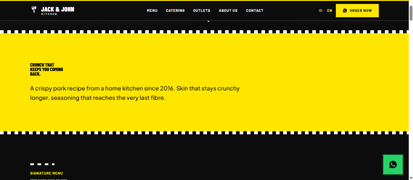
The vertical black-and-white stripe is the most distinctive visual asset — present across all packaging, bags and collateral. Three variants are used on the web:
Standard 24px
Narrow 12px
Diagonal 45°
Used for: dividers between major sections, left/right border accents on callout cards, loading states, decorative fields behind product photography, and "new" or "featured" badge backgrounds. Not used for: full-page backgrounds (too busy), backgrounds behind body text (legibility), or on top of yellow or red surfaces (it clashes).
Hashtags are not merely copy — they are graphic elements. Always uppercase, the # is part of the visual, they may be oversized relative to surrounding copy, and they may be used as a background texture at 8–12% opacity.
Three badge types: yellow with black text (ORDER NOW, MOST POPULAR), red with white text (BESTSELLER, NEW OUTLET), and a stripe field with white text (new variants). All use Barlow Bold at 12–14 px, 0.08em tracking, 6×12 px padding, and 0 px corner radius — promo badges are never rounded.
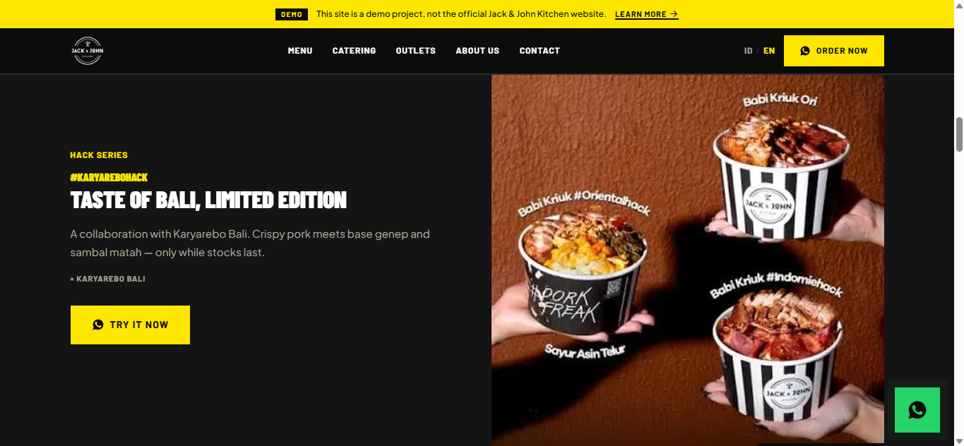
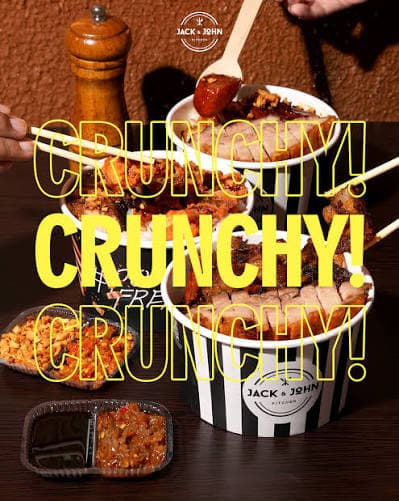
Style: dark, dramatic, editorial. Background: deep black or dark charcoal, occasionally dark marble texture. Lighting: a single strong directional source from above-front, so shadows and highlights on the pork skin turn dramatic. Framing: food fills 60–80% of the frame; never an empty plate. Colour temperature: warm — the golden amber of crisp skin pops against the cold dark ground.
| Context | Format | Max | Dimensions |
|---|---|---|---|
| Hero / full-bleed | WebP | 300 KB | 1920×1080 |
| Menu card | WebP | 80 KB | 800×600 |
| Gallery thumbnail | WebP | 40 KB | 400×400 |
| About / people | WebP | 120 KB | 1200×800 |
| OG / social share | PNG | 100 KB | 1200×630 |
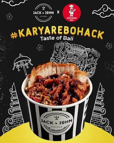
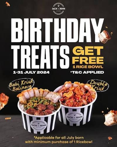
Do photograph: extreme close-ups of crackling texture, cross-sections showing the layers, steam rising off freshly poured sauce, hands holding or passing a bowl, several bowls together, sauce pouring in motion. Do not photograph: bright white backgrounds, empty plates, flat lays where props drown the food, out-of-focus heroes, or stock food photography of any kind.
Motion should feel like the food: fast, energetic, satisfying. No slow graceful fades — this is not a spa brand. Animations are snappy, purposeful and slightly surprising.
| ease-brand | cubic-bezier(0.22, 1, 0.36, 1) | Snappy entrance, smooth exit — the default |
| ease-impact | cubic-bezier(0.34, 1.56, 0.64, 1) | Slight overshoot — display headlines |
| ease-out | cubic-bezier(0.16, 1, 0.3, 1) | Standard ease-out |
| ease-press | cubic-bezier(0.4, 0, 0.2, 1) | Button press |
| instant | 80 ms | Button presses, toggle states |
| fast | 150 ms | Hover transitions |
| base | 250 ms | Standard UI transitions |
| moderate | 400 ms | Card reveals, dropdowns |
| slow | 600 ms | Section entrances |
| dramatic | 900 ms | Hero animations |
Every animation must degrade gracefully. Under prefers-reduced-motion: reduce, animation and transition durations collapse to 0.01 ms, iteration counts drop to one, smooth scrolling is switched off, and elements waiting on a scroll reveal are given full opacity immediately so no content goes missing.
| Variant | Surface / Text | Usage |
|---|---|---|
| Primary | Yellow #FFE600 / black | The most important action on the page — Order Now |
| Secondary | Red dark #C41A16 / white | Important but not primary — Catering, Contact |
| Ghost | Transparent / white, 2px border | Secondary action on dark — See Menu |
| Green #25D366 / black | Direct WhatsApp order links |
All buttons use Barlow Bold 14 px uppercase, 0.08em tracking, 14×28 px padding, 0 px radius, and shrink to 0.96 on press. The small variant uses 10×20 px padding at 12 px. WhatsApp buttons take black text rather than white: black on #25D366 is 8.2:1 while white is only 2.5:1 and fails AA.
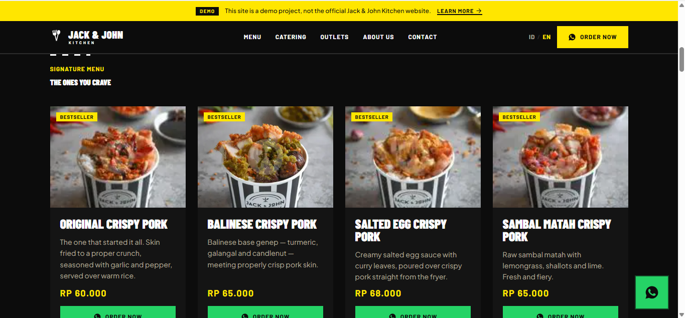
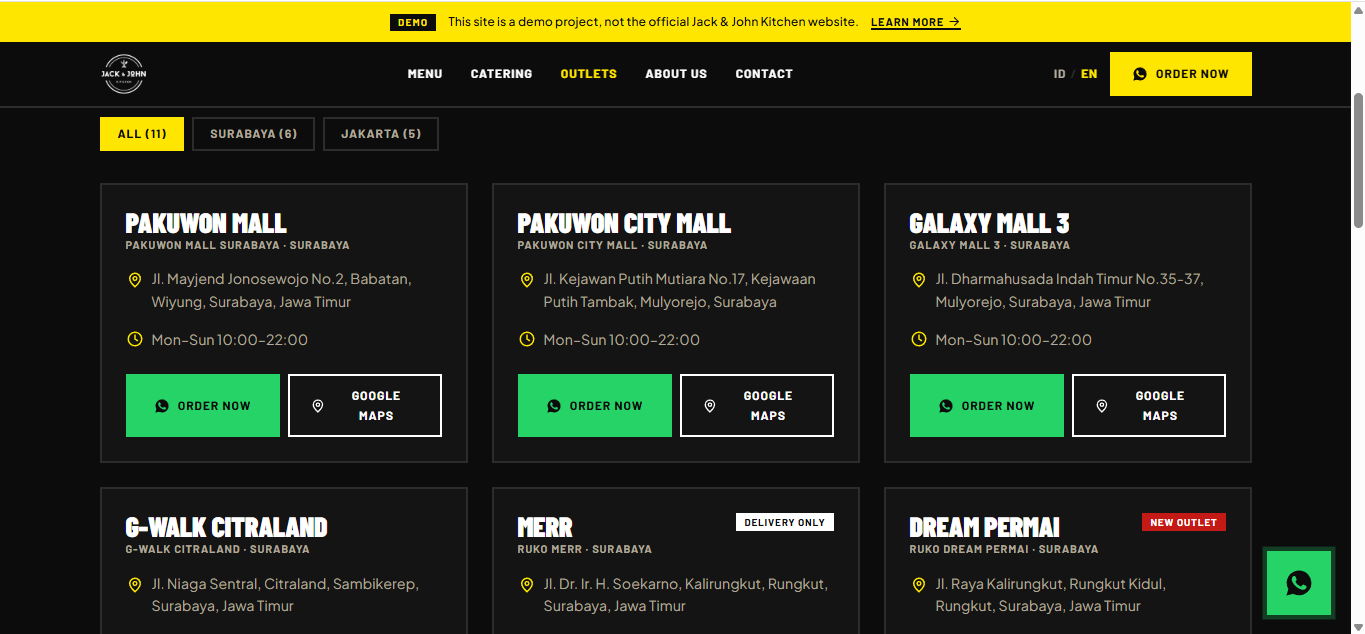
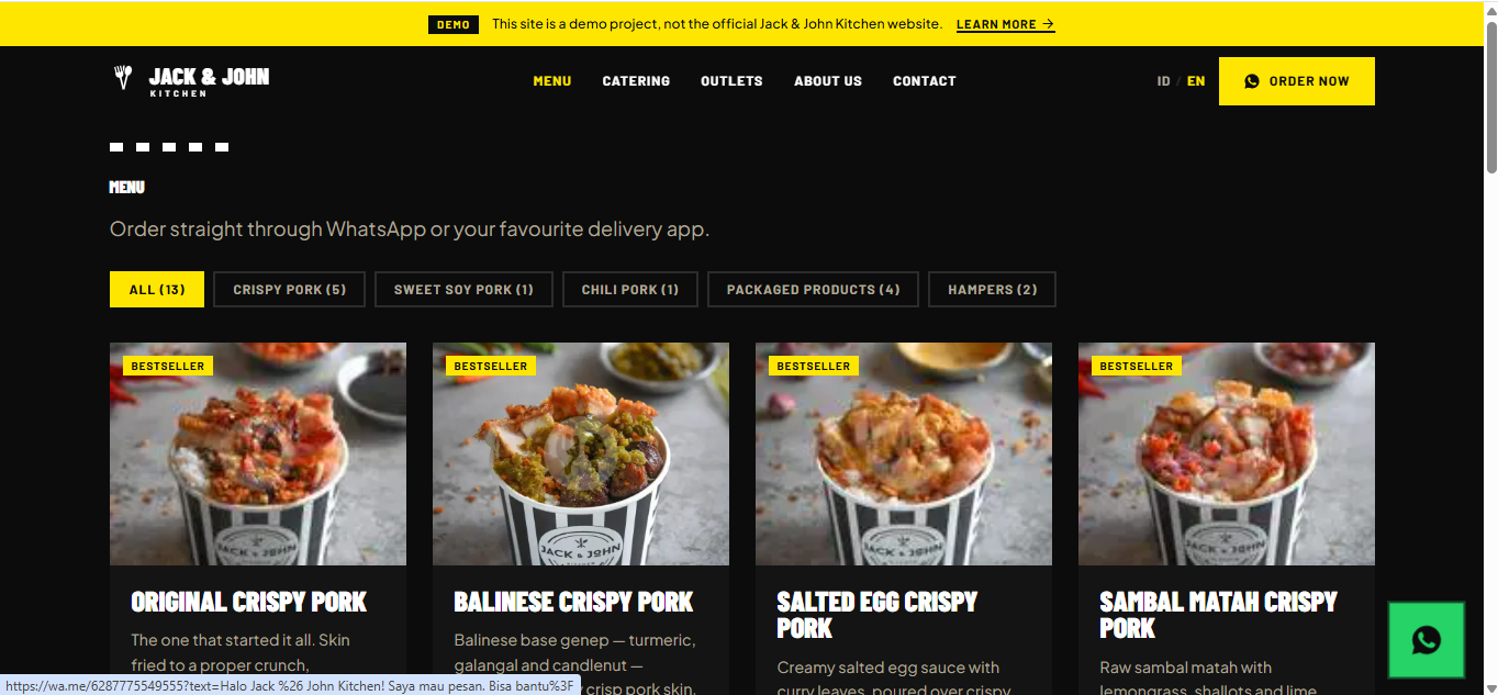
64 px tall on desktop, 56 px on mobile. Transparent over the hero, then switching to solid black with a bottom border once scrolled past 24 px — no soft transition, it snaps. The active link is yellow. The ID | EN language toggle and the Order Now button sit on the right. On mobile a hamburger opens a full-screen black overlay with stacked links at Barlow Condensed display size.
An 8 px stripe bar in continuous motion, placed between major sections. It is the cheapest and most recognisable way to repeat the brand signal.
An 8 pt base grid: 4, 8, 12, 16, 20, 24, 32, 40, 48, 64, 80, 96 and 128 px. Section padding is 96 px vertical and 64 px horizontal on desktop; 64 px and 20 px on mobile.
A 12-column grid, container max-width 1280 px, centred. Breakpoints: 480 px (large phones), 768 px (tablets), 1024 px (laptops), 1280 px (desktop), 1440 px (wide desktop).
Loud. Proud. Hungry. Jack & John Kitchen speaks like the best stall at the food festival — confident, energetic, a little cheeky. Never corporate, never over-polished, always making you want to eat.
| Principle | Example |
|---|---|
| Lead with appetite | "Crunchy. Savoury. Unmatched." not "We serve quality pork dishes." |
| Short sentences hit harder | "Crunch. Savor. Repeat." not a paragraph explaining texture. |
| Hashtags are first-class copy | Use #PorkFreak in headlines, not only in captions. |
| Bilingual but never awkward | Keep each language natural — never translate literally between ID and EN. |
| Action, not description | "ORDER NOW" not "Click here to order." |
| Own the niche | "The No.1 Babi Kriuk In Town" — state it, do not hedge it. |
| Action | Indonesia | English |
|---|---|---|
| Order food | Pesan Sekarang | Order Now |
| WhatsApp order | Pesan via WhatsApp | Order via WhatsApp |
| View menu | Lihat Menu | See Menu |
| Catering inquiry | Pesan Katering | Inquire Catering |
| Find outlet | Cari Outlet | Find Us |
| Learn the story | Kenali Kami | Our Story |
| Submit form | Kirim | Submit |
Every value in this document lives as a CSS custom property in app/globals.css, the single source of truth. Components never write literal values — they read tokens.
| Group | Token |
|---|---|
| Colour | --color-black, -black-soft, -black-stripe, -white, -cream, -yellow, -yellow-hover, -red, -red-dark, -grey-warm, -grey-dark, -whatsapp |
| Typography | --font-display, --font-heading, --font-body, --text-display-xl…-sm, --text-heading-lg…-sm, --text-body-lg…-xs |
| Text rhythm | --leading-display, -heading, -body, -caption, --tracking-tight, -normal, -wide, -wider |
| Spacing | --space-1 … --space-32 (8 pt grid) |
| Layout | --container-max, --section-padding-y, --section-padding-x, --nav-height, --border-radius (0px) |
| Motion | --ease-brand, -impact, -out, -press, --duration-instant … -dramatic |
| Patterns | --stripe-size, --stripe-white |
| Z-index | --z-base, -raised, -overlay, -nav, -modal, -fab |
The mobile override at the 768 px breakpoint touches only three tokens — vertical section padding (64 px), horizontal padding (20 px) and nav height (56 px). Everything else is identical at every screen size; there is no parallel mobile system.
Questions, feedback, or anything about this design system:
croissantsmoon@gmail.com
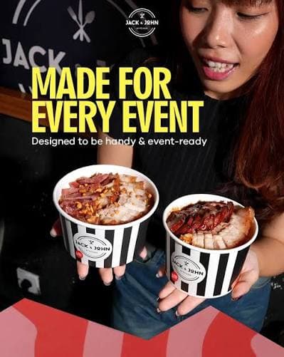
From 20 to 1,000 pax. We handle the cooking, you enjoy the day.
Choose a Package
Meetings, training days, or a team lunch.
Min. 20 pax · Order at least 3 days ahead
Birthdays, graduations, or a family gathering.
Min. 40 pax · Order at least 7 days ahead
Weddings and large-scale events.
Min. 150 pax · Order at least 14 days ahead
Send an Enquiry
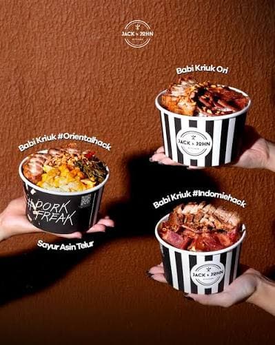
From office meetings to Lunar New Year with the whole family. We cook, you just eat.